

Beginning of the month JCK We caught up with Laurie Pressman, vice president of the Pantone Color Institute in Carlstadt, New Jersey, to talk about Brat Green—more specifically, to get Pressman’s thoughts on why the slime-green hue went viral earlier this summer (“It’s tied to this moment of self-expression,” she tells us).

But even though we came to see the colors of summer, we stayed to hear Pressman’s outlook on fall. In February, Pantone released its Fashion Color Trend Report for the coming seasons—a compendium of 10 colors the institute believes designers will use in their fall and winter collections. They include Scarlet Smile, a glamorous and decadent red; Aventurine, a mineral hue full of hidden richness; and Fern, a leafy green with roots in nature; as well as five new colors that Pantone calls its “core classics.”

“The colors for Fall/Winter 2024-2025 are fun but also functional, simple but not boring. They are straightforward and exude a confident, uncomplicated demeanor,” Pressman wrote in a statement announcing the report.
During our conversation, Pressman went into detail about the overall fall mood, the increasing emphasis on neutrals, and the true meaning of the color of the year. The interview has been edited for length and clarity.

(Note: A few days after our conversation, Pantone introduced the Pantone Color Insider, a new color information service with exclusive trend forecasts and color insights for the creative community, including jewelers. The service is available on the company’s digital platform and offers content and data including strategic color trend analysis, color education, and a quantitative overview of color developments around the world. Do with it what you will!)
Which colors will dominate this fall?
What we were looking for for fall was richness, earthiness, and our whole desire to be closer to nature. And I still think that’s at the forefront of our mindset. When it comes to fashion, we’re at a point where you’re looking for things that are fun but functional at the same time, things that are essential but not boring. We’re looking for those universal greens. We’re looking for those opulent midtones.

We’re rethinking neutrals because we’re living an increasingly hybrid lifestyle. And that’s something we’ve been talking about since COVID. So it’s about things that are functional, things that are adaptable, things that you can wear to the office but also for going out, things that just take us through a lot of different areas of our lives.

We keep seeing this interesting balance between what’s happening in our natural environment and what’s happening in our digital environment. And the more we get into technology, the more we jump back into the natural and organic world. Again, back to the greens that have become increasingly important to the way we think about neutrals today. It’s not easy. It’s really about this whole idea of luxury.
Can you elaborate on the idea of neutral colors and their place in fall fashion?
The neutral colours are probably the most interesting to me because they have taken on a completely different meaning. If you think about it, we are looking for honesty and transparency – these more natural tones, whether beige or cream or lighter greys, seem very natural and very honest.
They convey a message of simplicity, but are still classy and convey relaxed elegance. I think neutrals have taken on a whole new feel. It’s no longer just, “Here are my basic neutrals.” They’ve really been elevated.
How would you define a neutral color? Does it go with most other things or is it more of a background color?
I would say today the palette has expanded. Of course it’s beige and cream tones, but I think it could almost move to soft browns and khakis. So I think the color palette is getting broader.

In February, at the annual gem shows in Tucson, we saw the emergence of colors that people once found repulsive or ugly – like chartreuse yellow – and that was a precursor to what we see today with “Brat Green.” Is there such a thing as ugly colors, or is it simply because we view them with cultural baggage? And is there a reason why ugly colors might resonate?
I think it all depends on context. Yes, you could put it down to cultural baggage. It’s our perception of it. Think about it yourself. A color that you might have thought was ugly 10 years ago, you’ve now become so used to it that you suddenly think, “I kind of like that. I think I’ll wear that.” Or “I’ll get that in my house.” Sometimes that ugliness is because we’re not used to it. And it’s an insult because we’re not used to it. So it’s the unfamiliar aspect of it.
There is no such thing as a truly ugly color. It’s just our opinion of a color. That, like a culture, influences how we personally see color. People are more defiant and rebellious and intentionally want to wear things that are more repulsive. Maybe it symbolizes who they are, or maybe they’re intentionally trying to send a message: “I’m unique, I stand out, I’m confident.” I think their intention is to make a statement with something new, unknown and unique.

Looking ahead to 2025, when will you announce the new color of the year?
The announcement will be made on the first Thursday in December.
How long did you work on it?
For the color of the year, we do color trend forecasts. And of course, we always think about the color of the year when we do our color trend forecasts, because that’s an ongoing dialogue between everyone on the trend team and what’s happening and what we’re seeing.
But we start thinking about it and really talking about it in March. It’s really a reflection of what’s happening in the culture at this point. It’s not about a prediction. It’s about a reflection. How can color answer what we’re looking for? It’s an antidote. How do we feel?
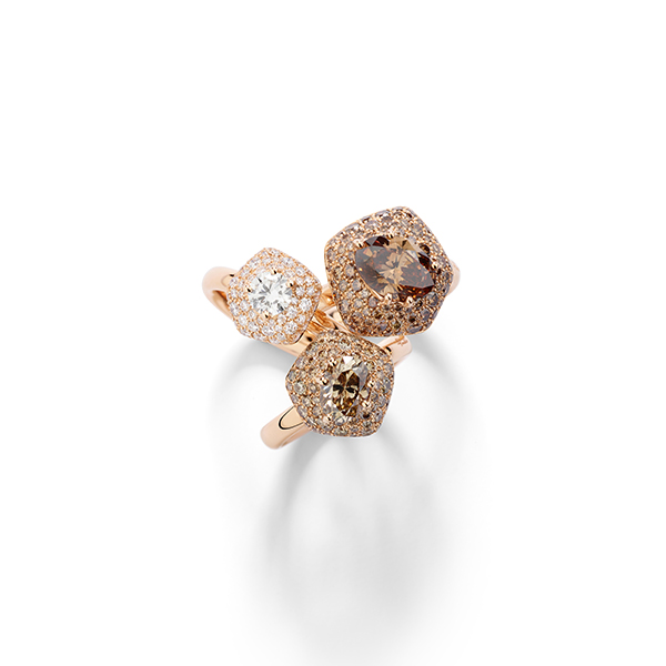
Above: Rings from Pomellato’s 2024 Haute Joaillerie collection
Follow JCK on Instagram: @jckmagazine
Follow JCK on Twitter: @jckmagazine
Follow JCK on Facebook: @jckmagazine
